We graphic design

How Itris made the move
to one clear brand identity

Itris came to us with a question about a rebranding. Not because everything had to change, but because the existing brand structure no longer matched the way the organisation actually worked together.

How we helped Itris lay the basis for a rebranding that brings more coherence, recognition and future-readiness

Under several names the teams were already working closely together, with shared departments and one clear direction. The challenge was to make that existing reality recognisable visually and in communication as well. What followed was not a standalone design assignment, but the building of a new brand foundation that Itris could keep developing

The challenge

Itris, NCCW and Bright Answers had been working closely together for years. Internally there was already plenty of connection: one leadership team, shared departments and jointly developed solutions. At the same time, multiple labels and structures caused fragmentation in external communication and appearance.

The challenge was to bring more clarity to that without undermining the strong foundation that already existed. The rebranding should not feel like a break, but like a logical next step. A step that strengthens recognition, trust and coherence.

A rebranding calls for more than design alone

In a project like this it is not only about how something looks. It is also about the choices behind it. Which appearance suits the organisation? What should stay recognisable? And how do you make sure a new brand identity is not only attractive, but also supported and usable?

In this project we did not only design, we also helped set the direction. By thinking along about the translation from strategy to brand and from brand to materials, a foundation emerged that holds up. In substance, in appearance and in use

The result

One brand foundation that brings more clarity and coherence

What started as a rebranding question grew into a solid brand foundation for the next phase of Itris. By bringing the collaboration, shared direction and joint ambition together under one recognisable identity, more calm and clarity emerged in how the organisation presents itself.

The new visual foundation makes it possible to communicate more consistently and show up more strongly. At the same time, what mattered was preserved: continuity, trust and recognition for clients and partners. The result is a brand that fits the organisation as it already functioned and is ready for further growth.

Working from one brand foundation delivered:

The strategic thinking
behind the rebranding

The strength of this rebranding was not in reinventing the brand completely. Quite the opposite. The question was how to make visible what was already there in practice: a close collaboration with one shared ambition for the housing association sector.

Thom: “The focus was on simplification, connection and recognition. One name, one visual foundation and one brand story that makes clear what Itris stands for. Not as a cosmetic change, but as the foundation for an organisation that wants to show up with more impact, clarity and coherence.”

Thom cirkel

Thom Oostenburg
Online Marketing Strategist

From brand story to visual foundation

From that strategic thinking we sketched the basis of the new visual identity. We developed the direction for the brand style and the logo, so that a clear visual line emerged for Itris to build on.

What mattered was that the new style should not only be distinctive, but also workable. It had to be a foundation that gives internal guidance and translates easily into materials, templates and communication. That created not only a new look, but a solid basis for consistent brand use.

From concept to concrete materials

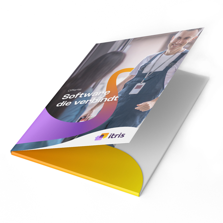
The new brand identity was not only worked out strategically, it was translated straight into materials that made the rebranding visible and tangible.

Deliverable 1: Logo

The logo is the core of the new brand identity. For Itris we worked out a concept built around the idea of “coming together”. Alongside the concept we also did the visual execution. Think of colour variants, applications on different backgrounds and use across a range of materials. That makes the logo not only a strong idea, but immediately usable in practice.


The result is a recognisable and flexible logo that serves as the foundation for every further brand expression. You can read how we arrived at the logo in the first slider.

Deliverable 2: Brand style

Based on the logo we worked out the visual direction for the brand style. Colour use, typography, shapes and composition come together here in one consistent style. The focus was on creating a visual language that is recognisable, yet flexible enough to work in different contexts. From presentations to marketing materials and internal communication.

Setting down this foundation gives everyone who works with the brand something to hold on to. At the same time there is enough room to develop the style further and apply it in new situations. That way the brand style is not a restriction, but a tool for communicating consistently and recognisably.

Deliverable 3: Photography

Alongside the visual identity we also used photography to bring the brand to life. Where design sets the structure, imagery creates feeling and recognition. The photography matches the new brand look and shows the human side of Itris. That matters in a sector where collaboration, trust and communication are central.

By deliberately choosing own imagery instead of generic stock photos, a more authentic and stronger brand experience emerges. The images strengthen the story and make the brand more tangible. Photography is therefore not just support, but an integral part of the brand identity.

Deliverable 4 : Video

For the launch of the rebranding Itris developed a video that introduced the new brand identity in a clear and powerful way. This was the moment the change became visible to the outside world. The video gave the new name and look a stage, and also helped convey the story behind the rebranding. That made it more than an announcement. It became a visual starting point for a new phase at Itris.

This video was not produced in collaboration with Leadgate.

Norman Vincent Peale

Dr. Norman Vincent Peale (1898–1993) was a minister and author (most notably of The Power of Positive Thinking) and a progenitor of the theory of “positive thinking”.

Schedule a call

Marketing strategy helps you with:

Reid Hoffman

Reid Garrett Hoffman is an American internet entrepreneur, venture capitalist, podcaster, and author. Hoffman was the co-founder and executive chairman of LinkedIn, a business-oriented social network used primarily for professional networking.

Eddy Huang

Edwyn Charles Huang (born March 1, 1982) is an American film director, author, chef, restaurateur, food personality, producer, and attorney. He was a co-owner of BaoHaus, a gua bao restaurant in the East Village of Lower Manhattan.

Mother Theresa

Moeder Teresa, geboren als Agnes Gonxha Bojaxhiu (Skopje, 26 augustus 1910 – Calcutta, 5 september 1997), was een katholieke zuster, stichteres van de Missionarissen van Naastenliefde en Nobelprijswinnares voor de vrede. … In 2003 werd ze zalig verklaard en op 4 september 2016 volgde de heiligverklaring.

Warren Buffett

Warren Edward Buffett (Omaha (Nebraska), 30 augustus 1930) is een Amerikaans zakenman en investeerder. Hij is directeur en met een belang van 38% grootaandeelhouder van Berkshire Hathaway. Buffett staat al enkele decennia op de lijst van rijkste mensen ter wereld met in 2021 een geschat vermogen van 109 miljard dollar.